Designing a Better Visualization of Constraints within Directed Acyclic Graphs of Scientific Workflows
At Strateos we enable scientists to create and run life science experiments on robots available via the internet. Scientists create experiments as "Runs" that are sent to our platform. After a Run is created, a user can explore the topology of that run in two ways.


At Strateos we enable scientists to create and run life science experiments on robots available via the internet, through both a graphical user interface and APIs. Scientists create experiments as "Runs" on our platform, Runs enter a queue until there is availability on our robotics. After a Run is created, a user can explore the topology of that Run in two ways to better understand their complex experiments. The first is a linear representation of instructions and the second is the Task Graph. In reality, given the hardware available to end users, the instructions contained within a Run can be executed with a degree of parallelism that isn't truthfully represented by a linear illustration of the steps. For this reason the Task Graph was created to more truthfully represent the steps and dependencies within a Run, ultimately showing the end user how a Run may have degrees of parallel execution.
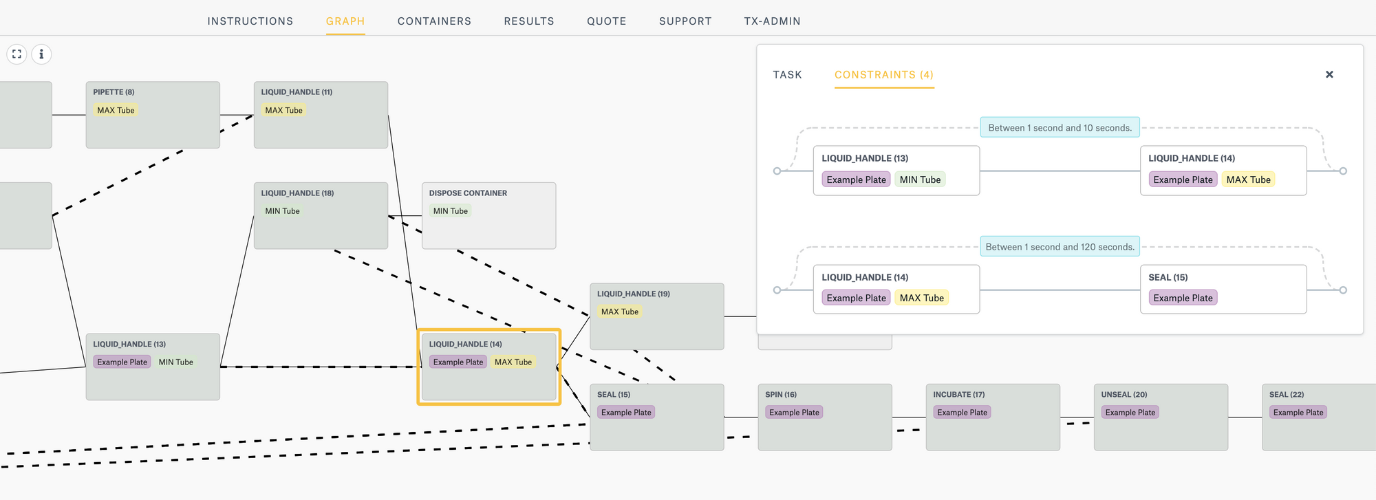
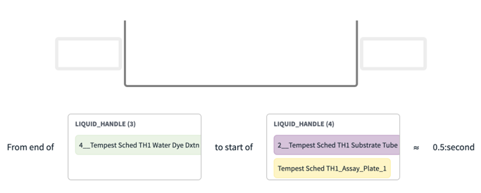
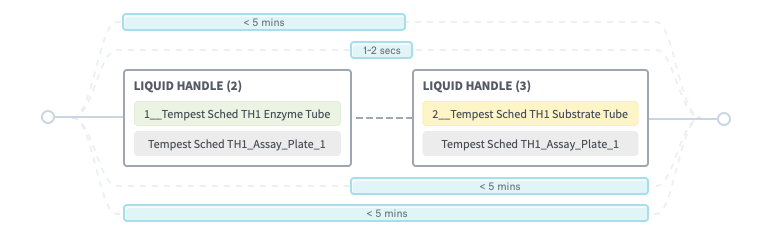
liquid_handle instructionThe Task Graph shows dependencies and timing constraints between instructions for an experiment. Each node shows an instruction, solid lines represent workflow dependency, and dotted lines represent timing constraints. Today, task graphs are used to help researchers understand how their experiments will be run before they submit them to the scheduler. Time constraints are a way to represent critical time dependencies of certain steps, for example some reagents once mixed must be used with 5 mins. Time constraints enable scientists to be explicit about the working bounds of a scientific protocol. These constraints are then used by our platform to help solve a complex schedule that respects the time constraints of the run once combined with our virtual models of the duration of many different kinds of operations.
The existing solution for visualizing timing constraints listed every time constraint with a diagram. For most cases of experiments, several time constraints would be imposed between multiple instructions. In these scenarios where there were multiple pre-condition dependencies for an instruction, it could become difficult to interpret for end users what the true dependency was.
How might we group the time constraints into a format users can understand at a glance?
Our Objectives
- Saving space, for each constraint we would generate a new line with the pair of instructions, so with multiple constraints we would quickly fill the page
- Merging constraints, to allow our users to understand all time constraints that relate to a set of instructions
- Better visual hierarchy, create better distinctions between the instruction, diagram, and time constraint(s)
- Delighting our users with a new experience
Design & Validation
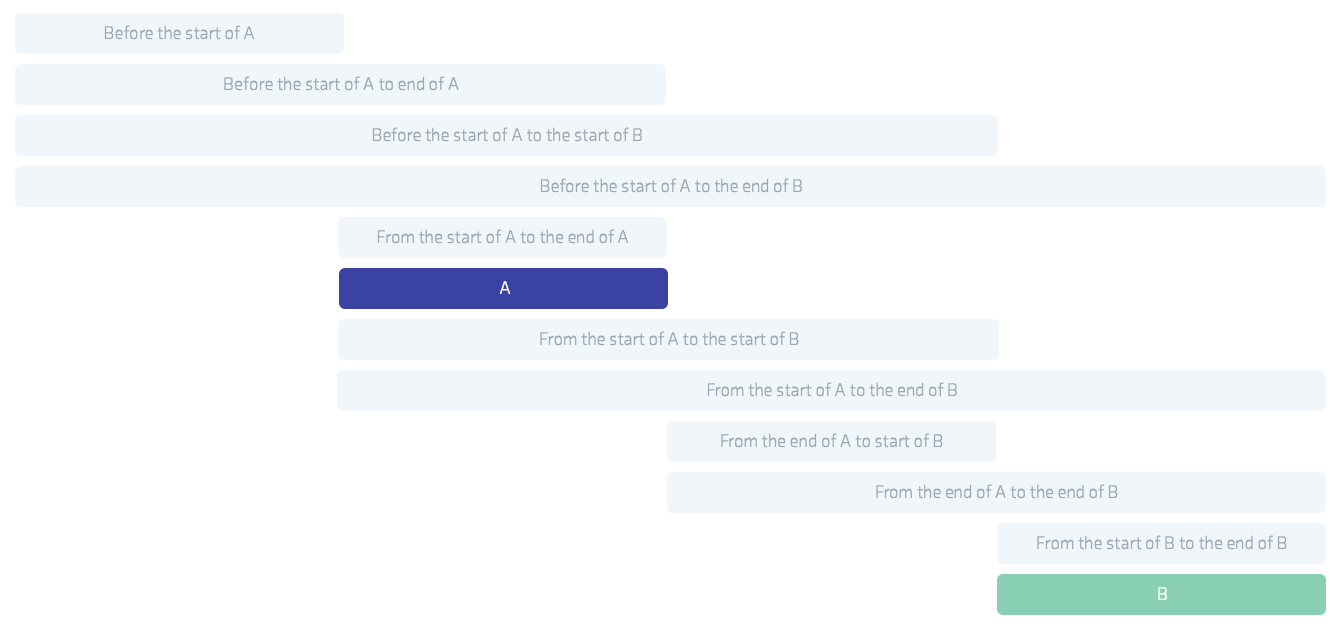
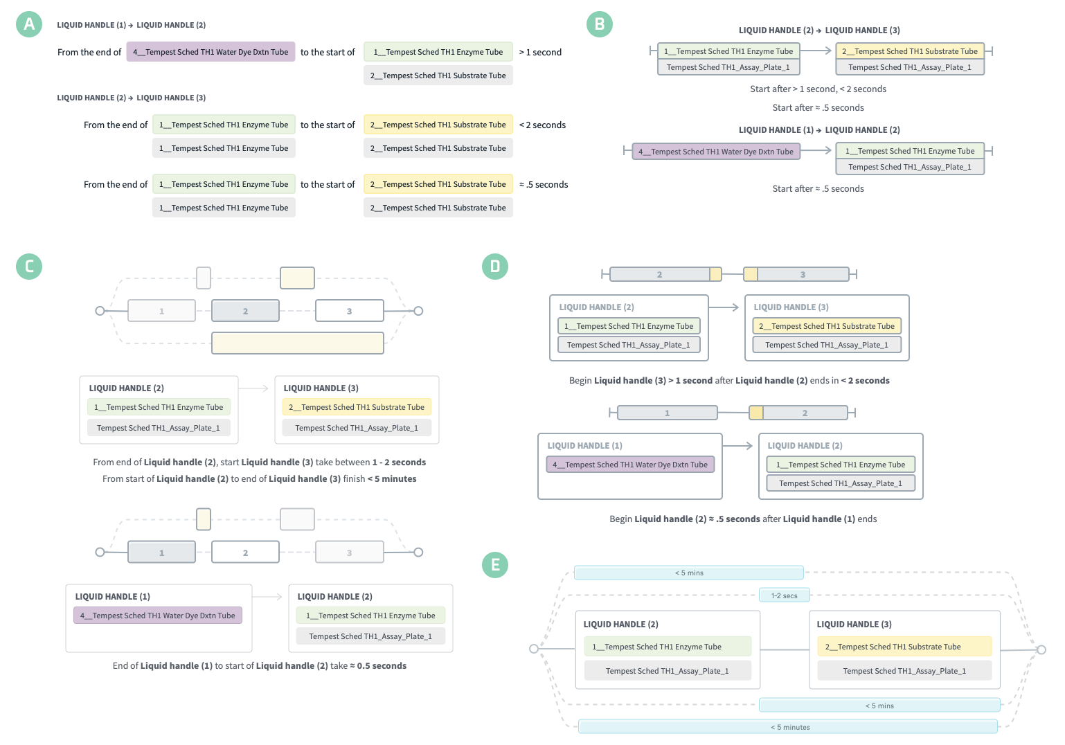
For our initial iteration, we removed the diagrams for each time constraint, hoping this would allow users to scan the page. But this warped the page into a giant blob of colors and words. Every iteration we did thereafter (figure 4) built upon the previous one, and we removed solutions that felt too systematic, wordy, busy, and unpleasant.
Final Result
The timeline branching view (figure 5) gave users a better sense of time between each instruction. The subtle dotted lines made it appear that times were connected, but the changes were also purely aesthetic. Users are now more confident reading a time constraint illustration than before.
How We Did
This was a small feature, but it still had a positive impact. Our users can quickly identify dependent time constraints and can make adjustments to their experiments without waiting for their run to start. Success!
Cover Art
Illustration by Icons8